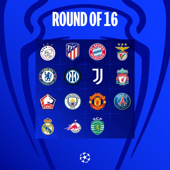
Haven't really paid much attention to club badges before, but there's some right shockers in there.
Atletico and Lille look like they could be American football franchises, Inter looks more like a car brand, Salzburg is basically just their sponsors logo, Juventus looks like a motorway sign, and Ajax looks like a doodle, or one of those optical illusions that could be a princess or a witch.
Bayern's is OK but uninspiring, and tells you nothing about the club. Only ours, Real, Benfica and Sporting look like proper football clubs. Even Utd's is half decent, but they blatantly copied it from our previous version.
City, Chelsea and PSG just look like cheap beer mats.
